Challenges
Why this project is challenging? Well. It’s impossible to design a product that meets the needs of our users if we don’t know our users and the needs they have. So, my objective is to identify the primary seller’s profile and achieve an optimal seller experience.
User Stories
In the past few years, I was working with some eCommerce and FinTech startups. The problem I always met is lacking UX process in the developing cycle. Oftentimes, UX is being considered as a block or slows down the project. Why did that happen? I think the major reason is all about how to communicate and deploy a proper UX strategy into the organisation. And the most efficient way is to leverage persona into a design workshop and use it EVERYWHERE. Try to encourage the team to think, speak and sleep on a persona when we try to come up with user stories. For example, “Richard would like to use size conversion feature because he is selling shoes across different countries.” Using “Richard to instead of “User.” And I found it’s easier to engage the team in the lengthy brainstorming session.
Build-Measure-Learn And Think-Make-Check
I’d like to use this method by Eric Ries’s to interpret how I play around with my team. After we understand what primary sellers profiles are, the next step is BUILD.
Conceptualise your idea by lo-fi wireframe
At this stage, we can just quickly use Sketch to wireframe and quickly communicate with PO or other stakeholders. Usually we always need to change back and forth several times till everyone is happy about that. Here’s an example of a seller user interface.
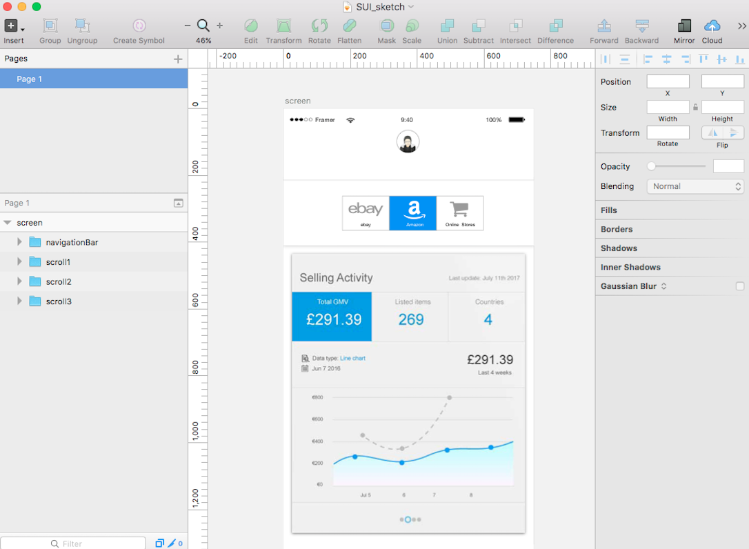 Wireframing your concept in Sketch (example: Mobile Seller User Interface)
Testing customers with high fidelity prototype
I know it has been always debated whether you’d test with lo-fi or hi-fi mockup with users. My suggestion is to use a high fidelity mockup. As matter of fact, users actually have more feedback if they feel they’re using a real-life product. In the meantime, you are also educating them to adapt to a new feature. I’ve been a big fan of Axure/CSS/Jquery when it comes to a high-fidelity prototype. It’d be reassuring that my testers would be well-received the prototype is exactly what I’m providing for. Recently, I start to try out Framer.Js, which is my fairly new tool for prototyping. It’s really powerful on interaction and motion design, and you can easily get immediate results from preview.
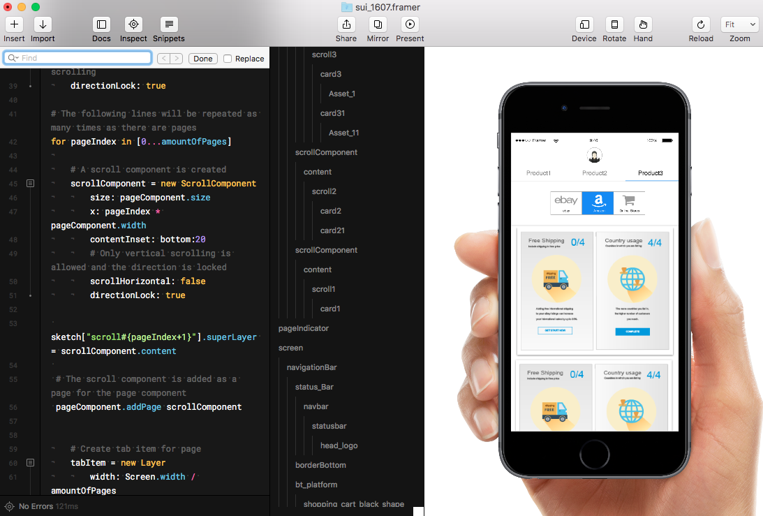 Animate UI in Framer
This is a simple animation on mobile Seller User Interface that I’ve made it from Framer.
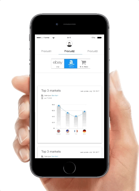 Mobile prototype in Framer.js
Then, MEASURE. Design validation is the most important part of my daily work. I always tell the team we shall test every feature as much as we could afford before handing over design documents to engineers. In an agile team framework, time is scarce and we try to keep everyone abreast of developing. By doing so, I bring the rapid evaluation and design process at each sprint or product iteration. We make wireframes and test them upfront in usability software or Google Analytics(you could check loop11 ), I feel it’s quite a handy tool to integrate task-based scenarios into mockups.
Last step, LEARNING. By continuing to collect user feedback and analysing the user’s path, we revise the design back and forth until the optimal usability goal is achieved.