Hey there! I’m writing this article to elaborate on how can we craft a user interface design through design systems, rather than crafting a just pretty collection of web pages. And yes! Sketch! I’m zealous in my effort to get this design system by using Sketch. But, first, let’s dive into the design system.
What is a design system?
A lot has been said about design systems, but more focus on a collection of assets and components for colour, typography, textures, girds and the like. They are pattern library and all of the reusable UI elements are visually consistent, but that doesn’t mean the assembled result will lead to a meaningful experience in my product. This type of thinking is certainly important, but I am slightly interested in what my user interface is comprised of and what I can construct the design systems in a systematic way when designers collaborate together with me in different time zones. (This is my current situation - Generative Design engineering software using by millions of ADSK customers. As experiences across the features continue to merge, I focus on common customer voice and visual language. )
In searching for this answer, I am wrapping up a definition of the Human Interface Guideline from my current project - 3D design software on manufacturing and simulation.
Basics.
Basics(atoms) are the foundation of our product designs. They make up the fundamental style and details that govern all of the other elements.
Components.
Components(molecules) are groups of UI elements that work together to make up a functional piece of the product experience. Components may be used in a variety of contexts, but they should always serve the same purpose and function in a consistent way.
Layouts.
Layouts are consistent patterns for specific types of pages or screens found in our products. These are the most often used, and often the most recognisable parts of the UI.
Mini-Experience.
These are key workflows and tasks that are similar for customers across a variety of our products. In these experiences, a customer may move through a number of steps within a flow or navigate through a series of related screens. These experiences offer the best opportunity to simplify complexity and delight customers with thoughtful details.
Create Basics
Symbol libraries
Choose Insert › Symbol from the pop-up menu, and insert an instance of your Symbol from its Library into the Canvas.
I used to use Adobe illustrator for creating all of UI assets and components. I still do, because the pixel is more accurate than Sketch. But the library in Sketch is simple and useful.
In this stage, you’re creating a foundation of visual design language.
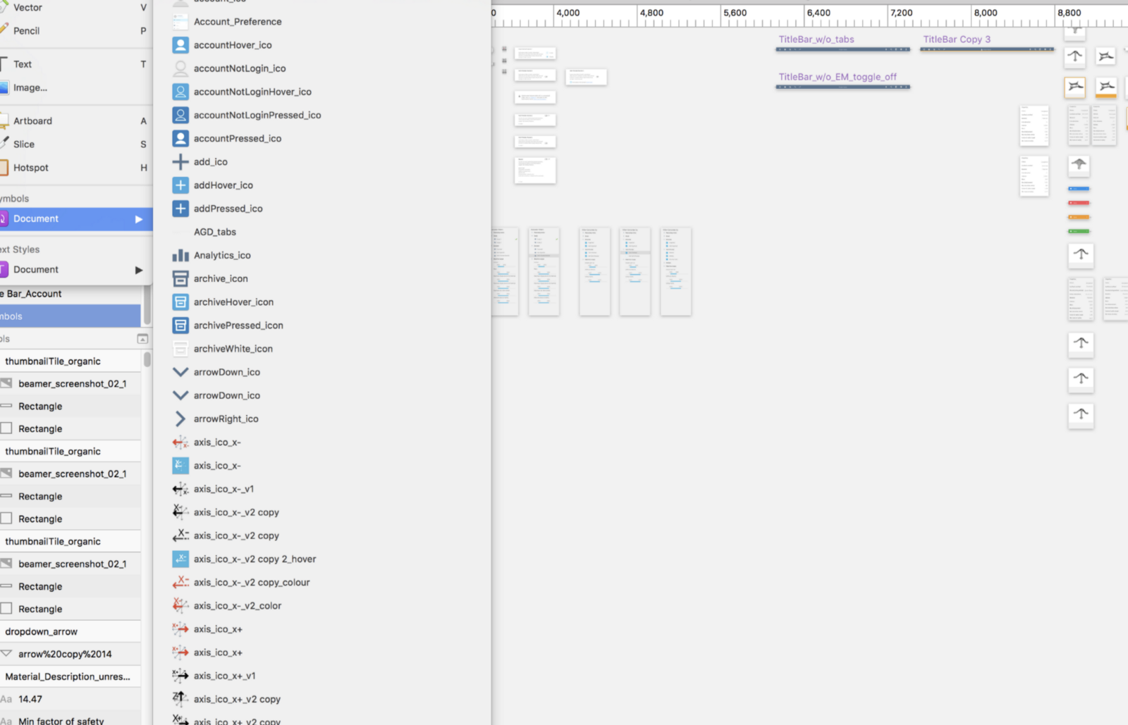 3D simulation software involves a lot of icons and buttons and the Symbol library happens to be the best tool when other designs need to use the library file you’ve created.
Colour
The common colours of a design system contain no more than 3 primaries to represent your product identity (Brand).
 3D simulation software targeted at Engineers and Industrial designers. The persona has defined how we use the colours in the application. It’s leaning forward to the
 Primary colours in grey and blue shades.
Typography
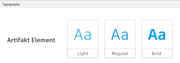
A best practice of typographic design is avoiding the excessive number of fonts. We only use the one typeface - Artifakt, which is reflected product personality - sophisticated, technical and beautiful without decoration. And there is a good tool to measure the size of the font.
Spacing
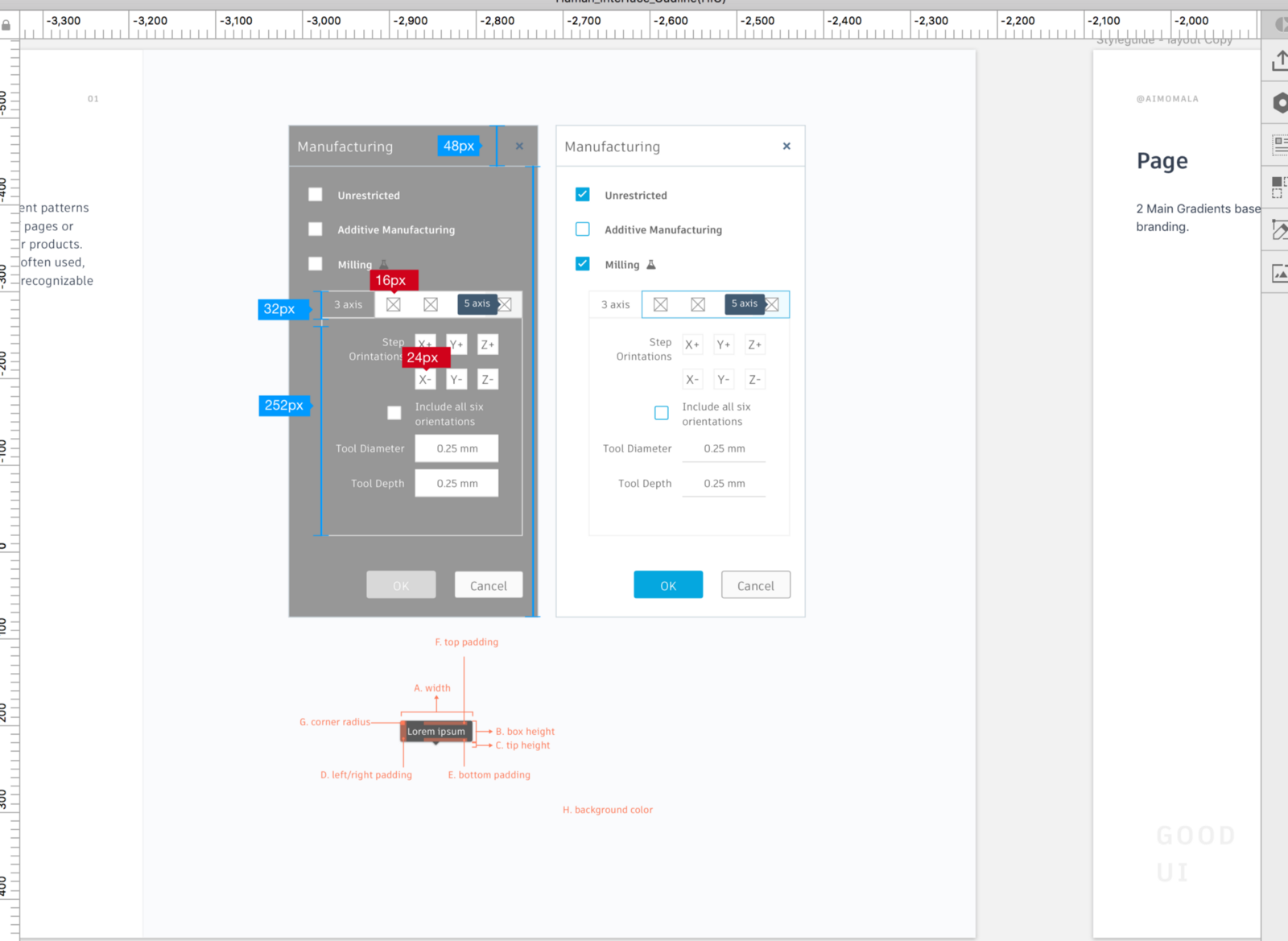
This is very tough to make a standard. The best practice is to adhere to the safe area and layout margin defined by UIkit. Oftentimes, there’s a gap between designer and developer, “I design in this way, you build in that way”. I personally use InVsion Inspect to communicate with developers by following the visual guide in Sketch. If you are dealing with responsive web applications crossing different sizes of devices in IOS. The best resource is Human Interface Guidelines. I certainly like to make the spacing in my product as similar as IOS HIG if I don’t have standard guidance at hand. It’s a safer approach to make your UI looks balanced.
Icons
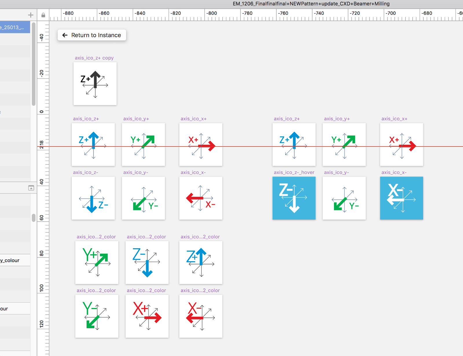
A key to success in icons is designed as glyphs - a template image. In our application, we often use Icons as a button. We use colour to communicate hover, selected and de-selected states on icon buttons. It’s important to make your icon as glyphs automatically receive the appropriate appearance (colouring) based on the context of your interface.
Create Components
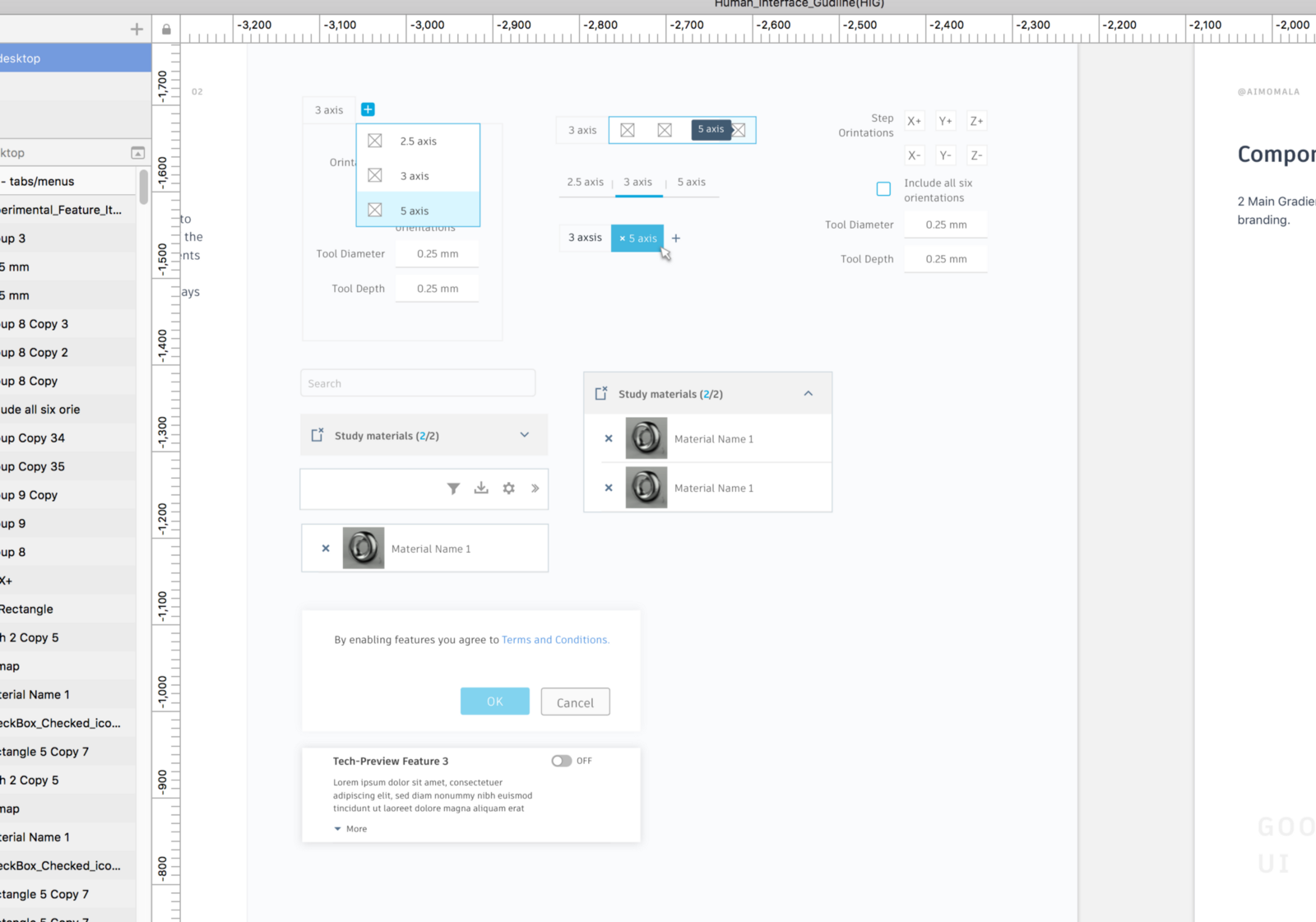
Buttons, icons, forms are not too useful if they are not put together as a component. Thinking as a component is the smallest unit in your product design. It can serve its own purpose in the design system, for example, a search form, drop-down menu, modal shell and the like.
Create Layouts
So, now we are getting concrete on how the final design my take shape. And this stage is to get your clients to start to see the design coming together. Layouts consist the groups of components stitched together to form a layout.
Create mini-experiences.
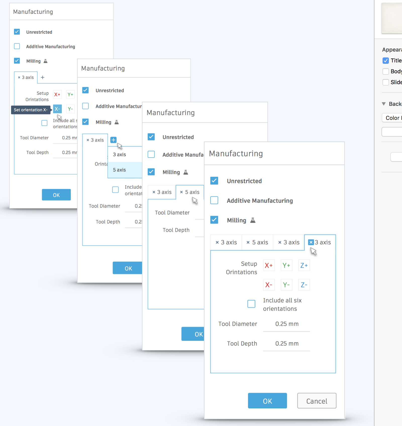
Considering this is my conclusion, too. In my humble opinion, a Design System is not equivalent to a Pattern Literary. Minimal experience is the interactive and tangible stage to validate the effectiveness of the design system. And what is the validating process in UI? I had another article in my previous project on the global trading platforms. This is the link just in case you are interested.
UI Design is a process and reviewing everything (UI problematics) in context allowing us to circle back to modify the Basics, Components, Layouts until creating a minimal & intuitive design for your targeted customers.
References:
- Human Interface Guide in IOS
- Apple design resources
- DesignBetter.co
- Space in design system
- A comprehensive design guide to design systems
- Adobe symbols
- Sketch literary
- Atomic design/ Brad Frost
